Color Schemes 101: How to Choose the Right Colors for Your Space

### Color Schemes 101: How to Choose the Right Colors for Your Space
Choosing the right color scheme is one of the most important aspects of designing your space. The colors you select can influence the mood, aesthetics, and functionality of your room, and getting it right can make your home feel more cohesive and welcoming. In this guide, we’ll cover the basics of color schemes and offer tips to help you select the perfect palette, along with product recommendations to bring your vision to life.
#### 1. **Understand the Color Wheel**
Before diving into color schemes, it’s helpful to understand the basics of the color wheel. The color wheel consists of:
- **Primary Colors**: Red, blue, and yellow.
- **Secondary Colors**: Green, orange, and purple, created by mixing primary colors.
- **Tertiary Colors**: A mix of primary and secondary colors, like red-orange or blue-green.
By using the color wheel as a reference, you can create harmonious color combinations that work well together.
**Key Terms to Know:**
- **Complementary Colors**: Colors directly opposite each other on the color wheel (e.g., blue and orange). These colors create a vibrant contrast.
- **Analogous Colors**: Colors next to each other on the color wheel (e.g., blue, blue-green, and green). These colors create a serene, harmonious look.
- **Monochromatic Colors**: Different shades, tints, and tones of a single color. This creates a cohesive and soothing effect.
#### 2. **Choosing a Dominant Color**
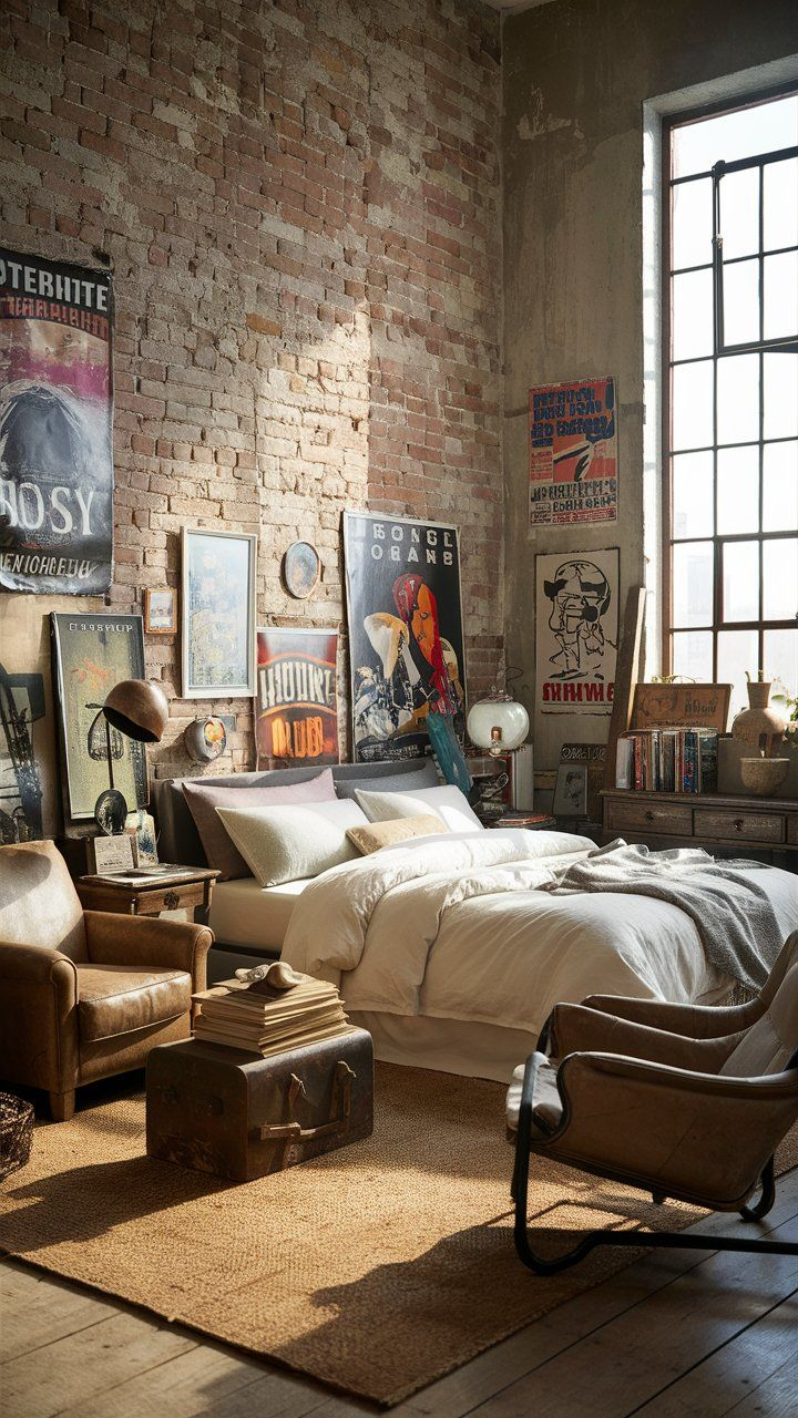
Your dominant color will set the overall tone for your space. It’s usually the color that takes up the most real estate in the room, whether through the walls, large furniture, or flooring. Neutral tones like beige, gray, and white are popular choices for dominant colors, but don’t be afraid to go bold with darker hues or vibrant shades.
**Tips for Choosing a Dominant Color:**
- Think about the mood you want to create. Soft, muted colors (like light gray or pale blue) create a calm and relaxing atmosphere, while bold colors (like navy or dark green) add drama and sophistication.
- Consider the lighting in your room. Natural light brings out the true color, while artificial lighting can change how a color appears. Test swatches on your walls to see how they look at different times of the day.
**Product Recommendation:**
- **Sherwin-Williams Paint Color Samples** – Try out different paint samples from Sherwin-Williams to test how your dominant color will look in your space. Popular choices include "Repose Gray" for a neutral, calming tone and "Naval" for a bold statement.
#### 3. **Incorporate an Accent Color**
An accent color is used to complement your dominant color, often found in smaller elements like throw pillows, artwork, or rugs. This is where you can experiment with more vibrant or contrasting colors to add personality to the space without overwhelming it.
**Tips for Choosing an Accent Color:**
- Use the color wheel to select complementary or analogous colors to your dominant shade. For example, if your walls are painted in a soft blue, a coral or peach accent can provide a lovely contrast.
- If your dominant color is neutral, you have more flexibility to experiment with bright and bold accent colors, like mustard yellow or teal.
**Product Recommendations:**
- **Rivet Modern Throw Pillow** – This mustard-yellow throw pillow is perfect for adding a pop of color to neutral-toned furniture.
- **Moroccan Blythe Area Rug** – A beautifully patterned rug that incorporates subtle colors, adding both texture and visual interest to your space.
#### 4. **Use a Secondary Color**
The secondary color acts as a bridge between your dominant and accent colors. It’s often found in furniture, curtains, or other significant items in the room and helps to balance the overall look. Secondary colors are typically less intense than accent colors but provide depth and cohesion to the room’s palette.
**Tips for Choosing a Secondary Color:**
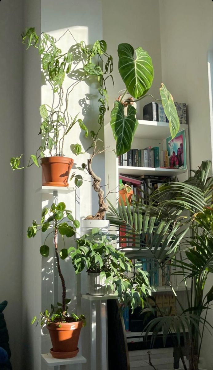
- Look for inspiration in natural elements like wood, stone, or plants to find secondary colors that blend seamlessly with your dominant and accent choices.
- Consider the undertones of your dominant and accent colors. For example, if your dominant color has cool undertones, choose a secondary color in the same family to maintain harmony.
**Product Recommendation:**
- **Madison Park Curtains** – These elegant, solid-colored curtains come in a variety of shades and can act as a subtle secondary color in your decor.
#### 5. **Balance Warm and Cool Tones**
Understanding the difference between warm and cool tones can help you create a balanced color scheme. Warm colors (reds, oranges, yellows) tend to evoke energy and excitement, while cool colors (blues, greens, purples) create a calm and relaxed atmosphere. Neutral colors can lean either way, depending on their undertones.
**Tips for Balancing Warm and Cool Tones:**
- Use warm colors in spaces where you want energy and socialization, like the kitchen or living room.
- Use cool colors in areas meant for relaxation, like the bedroom or bathroom.
- Neutral tones like beige, gray, and white can act as a balancing element between warm and cool tones.
**Product Recommendation:**
- ** Indoor Outdoor Rug** – This rug has a mix of warm and cool tones in its pattern, making it easy to blend with different color schemes while adding a touch of sophistication to your space.
#### 6. **Test Your Palette Before Committing**
It’s always a good idea to test your color palette in the room before making any major changes. Whether it’s testing paint swatches on the walls or ordering fabric samples for curtains and pillows, getting a sense of how the colors interact in your space is essential.
**Tips for Testing Your Palette:**
- Try out paint samples in different areas of the room to see how they look in natural light versus artificial light.
- Use color apps to visualize how the color scheme will appear before making a decision. Some apps, like Sherwin-Williams' ColorSnap, allow you to upload photos of your room and apply different color schemes.
**Product Recommendation:**
- **Sherwin-Williams ColorSnap Visualizer App** – This app allows you to upload a photo of your room and virtually apply different paint colors to see how they’ll look before committing.
#### 7. **Create a Mood Board**
A mood board is a visual tool that helps you gather inspiration and ensure your color scheme works well with the overall aesthetic you want to achieve. You can use physical items like fabric swatches and magazine clippings, or digital tools like Pinterest to curate your color ideas.
**Tips for Building a Mood Board:**
- Gather inspiration from various sources, such as interior design websites, Pinterest boards, and Instagram feeds.
- Include not just colors, but textures and patterns that you’d like to incorporate in the room. This will help you visualize how everything will come together.
**Product Recommendation:**
- **Cork Bulletin Board** – Use this simple cork board to create a physical mood board where you can pin paint swatches, fabric samples, and photos of inspiration to guide your design.
---
### Conclusion
Choosing the right color scheme is a vital step in creating a space that reflects your style and meets your functional needs. By understanding the basics of the color wheel, selecting a balanced palette, and incorporating the right shades through dominant, accent, and secondary colors, you can create a harmonious and visually appealing room.
Investing in quality decor items, such as statement rugs, throw pillows, and elegant curtains, will bring your color scheme to life while adding depth and personality to your space. Whether you prefer a calm, neutral palette or something more vibrant and bold, the tips and product recommendations in this guide will help you design the perfect color scheme for your home.

Comments
Post a Comment